The form of production I worked to achieve is a music video, the genre being Alternative hip hop/pop rap. Both of these genres are associated with the Gym Class Heroes who released the music video I chose called ‘Stereo Hearts’. The Alternative hip hop genre refuses to conform to the typical stereotypes associated to hip hop and takes influences from all kinds of music. Pop rap however, is more conventional of the hip hop genre and is stylized by four key elements including dancing, DJing/scratching, rapping and graffiti writing. These genres are regarded as ‘mainstream’ and are certainly more widely distributed and listened to by teenage audiences than folk or jazz music. Many artists/bands within this genre of music are signed by subsidiary record labels or independent labels as they aren’t seen as the ‘perfect pop star’ and aren’t as conscious about image, just their creations of music. The genres of my music video are strongly enforced throughout this video and display all of the key elements at some point. My music video follows some of the main, distinct conventions of mainstream music with a clear narrative being shown throughout and parts of lip sync material. After looking closely at the original music video for this song, I chose to make an intertextual reference to the original in the opening shot with my main character sat on some steps but with a musical instrument instead of the boom box. The male I chose as the lead singer of my band ‘D.C.N’ and the featured artist both conform to mainstream music. Short hair, young, fashionable clothing and actions you would typically see in a mainstream music video. I specifically told the characters to wear fashionable, branded clothing as they are all my friends and we wear this type of clothing all the time and it gave the video a modern, ‘fresh’ feel for teenagers to relate to. The checked shirts, chinos, high top shoes, Barbour jackets and leggings for women all represent the time the video is made and are iconic to the way people of this generation dress. The featured artist is common in this genre of music and collaborations are often seen. Also, the main band member to ‘D.C.N’ is seen throughout and the supporting members play minor roles, not contributing to the narrative. The only person in the video who doesn’t conform to the mainstream is me, and that’s only due to my ‘alternative’, longer hair style. Apart from this, scenes of modern forms of dancing, rapping against graffiti backgrounds and settings of derelict-like settings with an urban feel all conform to the genre being represented. I chose not to show any ‘real’ performance based clips apart from when the lead singer is strumming the guitar in some shots which doesn’t match the music in time as a guitar is used to create the sound but it adds to the narrative and intertextual elements of the video. I also drew some influences from many lyric videos that are out to go with the official music videos by flashing some lyrics up in screen to create a modern feel and imitate the effects some released videos have.
With all music videos being postmodern and borrowing elements existing videos whether it be film, T.V or musically they parody or pastiche them in many cases and refer to them intertextually. My music video draws upon many modern media texts which are funny to create references to the audience who will know of the references I intentionally made. Many of the dance moves and shots of the band having fun and being teenagers relates to the audience and reflects the nature of the band and reflects a comic genre and postmodern vibe. For example, the references to the T.V program ‘The Fresh Prince of Bel Air’ are shown in three dance clips. The ‘Jump on it’ dance where Will and Carlton perform a funny routine is re created against a modern feel to in keep with the hip hop genre whilst reflecting back on a previous media text. This upbeat vibe to the video is also reflected through the weather in which the video was shot, sunny weather connotes happiness and positive feeling. However, in some shots, the sun is drawing in and the shots are darker. This was done on purpose as one of the lines in the song reads ‘I think I finally found a note to make you understand, if you can hit it sing along and take me by the hand’ which reflects the imagery of the lines in the song being when he is trying to make his girl understand how he feels and wants her to be on the same wavelength, I thought that by taking these shots when the light isn’t as strong it looks like he’s losing hope and losing faith in what he’s trying to do. Also, the featured artist is ‘Luke Mitchell’ who is more of a pop singer whereas the lead singer of ‘D.C.N’ is more rap based, the majority of his shots are against a graffiti wall I found with lip sync which looks really good and maintains the genre. I shot on two separate occasions at the graffiti wall and on the second time, there was a full wall with new graffiti which was even better than the first clips which was lucky and allowed me to set the scene for the shots in various settings but was actually the same wall throughout. These graffiti walls keep the urban feel and really reflect the teenage lifestyles people have in this genre of music. Another feature of music videos in the same genre/time of production is the actions to match the lyrics. This was a problem at first as the people I chose to perform in the music video were inexperienced and took a few takes to keep in time and really incorporate the lyrics into their actions, eventually making for some great shots which connote lyrics through actions and vice versa. Before I shot any of the video I sat down and planned out what exactly I wanted to do with the video and how I wanted to present the song to the audience. This included a clear narrative structure which I think I achieved and some shots showing that the video keeps in mind the age of the performers and shows their lifestyles alongside the industry they probably work in and allows my target audience to relate to this.
At the end of the chorus each time the series of ‘oh oh’s’ is almost a celebration of the fact the song says about the girl becoming the man’s. I chose to emphasise this through using this part of the song to put in dance moves and clips of the band enjoying themselves whilst referencing media texts such as dance moves off the music video ‘Yeah 3x’ (figure 2) by Chris brown and the ‘Inbetweners movie’ (figure 3) which the majority of people in the target audience have seen. Also the previously mentioned T.V show ‘The Fresh Prince of Bel Air’. I also shot some clips of the band doing some other moves and put some in which were funny and reflected the postmodern era my video was made in. I looked at many music videos before and during the production of my video and used effects from music videos such as ‘Drunk’ (figure 4) by Ed Sheeran and ‘Down with the Trumpets’ (figure 5) by Rizzle kicks. I particularly liked these two as they had various effects I liked and wanted to incorporate into my video. The shots of a woman flicking water from a sink and then the artist jumping up from his bed as though it hit him being juxtaposed created a good effect which I was impressed by. From ‘Down with the Trumpets’, my favourite part of a music video I’ve ever seen is when the two singers are stood together and singing then one of them bends down and does a push up, appearing to go down to the press up and as he moves down, appears in a different shot which is a really clever clip made up of smart editing to cut together a sequence of movements. I used both effects and merged them into my own, new sequence. Starting with the Rizzle Kicks effect but landing in a shot of the lead singer sat on a park bench looking dazed and as though he doesn’t know where he is. I really like the shots I cut together and think it’s obvious what I’ve done if you have seen the videos.
According to my online Poll I conducted on my blog, 35% of respondents said the settings and props were the most important and 64% said that a narrative to follow the lyrics was the most important feature of a successful music video. This in mind, I used props to match lyrics such as police man outfits to match lyrics about cops and a old boom box I bought from the internet to show as a reminder of the name of the song and re enforce the message of the video. My target audience will be in full or part-time education in most cases and have a weekend or part time job of some sort. This in mind, disposable income will also come from parents or guardians which will fund teenagers and early twenties musical interests whether it be albums, CD’s, downloads, magazines etc. they will be interested in what my product has to offer them. With the audiences psychographics, demographics and ‘VALS’ taken into consideration, this genre of music really influences the right people I’m targeting. Falling into the demographic group E first appears to be a limited audience but the vast amount of people in education in this age range makes up for the relatively small portion of the population being associated with the E category.
I also kept the setting of shots in mind such as the graffiti walls (figure 6) and used industrial looking backgrounds (figure 7) based behind a factory to film the main chorus shots which added to the urban feel of the video. The main narrative of the video involved a woman who the lead singer of ‘D.C.N’ is singing about all the way through. I used a woman in the video as opposed to the original which had no women in it. I felt that singing about a woman and not including one in the video was a bit of a misguided video so I thought the narrative would be better with a woman to aim the lyrics at. I shot a lot of footage with the lead singer singing to the woman to make it more personal and reflective of the lyrics. The video is self aware as its aware of it’s effect on a woman and understands the process of ‘getting a girl’ and ‘chasing them’ and being in competition with everyone else etc. The end of the song is as important as any other in my opinion and I carefully thought how I could end the song as the music fades out near the end but the video is still running. I chose to end with the lead singer walking to a car which I used throughout to see the girl to and politely opens the door for her (figure 8) , closes it and the camera pans to see it drive off which signals the end of the chase for the woman and the end of the video as a narrative. Another aspect of props I considered was the type of car I used throughout. I eventually decided on a Range Rover sport which connotes expensive lifestyles to match the desire for the best of everything to relate to the demographics of the genre of music this fits in to. I played on the stuttering, DJing effect on the line ‘I used to used used to now I’m over that’ and matched the pace of the lyrics with quick cut shots of different angles of the singer which I think works really well and looks professionally done. Also, I merged two shots into one (figure 9) by changing the visibility of two clips played over each other to show one on top of the other which I also think looks good and relates to many of the new effects of a mainstream music video we are always exposed to. In order to maintain a feel of continuity throughout to accompany the narrative of my video I had to make sure everything was smooth looking with no gaps or jump cuts. Whilst playing back some footage I noticed I had made a continuity error by showing the boy and girl holding hands in a different location to the shots either side of it which when pointed out looked odd. Thankfully, this was before I finished editing so I could amend it and maintain continuity.
With my video being postmodern, I was able to include many intertextual references throughout the video which my mainly teenage audience would be able to identify and relate to. Many of my target audience will download online either legally or not but, digipacks can be something different for fans as they aren’t just getting a CD as they would with an album but a DVD of the video to accompany the featured track. My audience will live their lives keeping up to date with fashion and the latest language circulating the world. This in mind, I made sure I dressed all my actors appropriately which proved easily done as they are all teens who fit the mould of my audience. The different speeds and angles of shots meet expectations of my audience and make the video aesthetically pleasing to teenagers and reflect their fast paced lifestyles.
Audience feedback is very important to all three of my products as it offers me an opportunity to see where I could improve my product and identify good and bad parts to my video. A key part of this feedback allows me to gain knowledge of what people who fit into my target audience think of it and whether or not they would purchase a DVD of it and would pick the digipack up from the shelf and at least listen to it. Throughout the production stage of my product I asked for people’s opinions whilst developing each product to allow me to constantly improve and make changes. This was very useful and some feedback offered me new ideas to incorporate into my products. I didn’t do a draft of my video as I left filming a bit later than planned due to work commitments of actors and found certain parts difficult as the female actor dropped out. I had to act quickly and choose a new, suitable actor for the role. The female was a key part in the narrative. The graffiti on the walls of some shots when the main character is alone reflect the gang culture and when all of the males are together having fun dancing and singing. Graffiti is also a key element to the genre of hip hop. However, when the main character is with the female, there is nearly always a grassy and peaceful backdrop (figure 10) or setting to the shots to convey his happiness at being with the girl he’s singing about which reflects the binary opposition I created between the main characters and their friends.
Before filming anything or even picking up a camera, I put together a storyboard by drawing up some rough stick men pictures with the timings of shots, their angles and editing notes to help with the production of my video giving me a rough guide. As I am a poor drawer I opted for stick men as I could understand each picture and it also saved some time drawing perfectly every shot for the purpose of a guideline. When it came to editing the footage I had I tried using the storyboard as the rules for my video cutting each shot ‘perfectly’ in accordance with the storyboard but soon found that I should only use it for an outline and that it wasn’t going to fit together perfectly with room for new ideas I didn’t first include on the storyboard. I had many ideas after drawing the storyboard but only changed it slightly as I liked my original ideas. All of the planning and research methods I used ended up on Blogger. Everyone on the course used Blogger which proved to be a very convenient and useful method of uploading all of my research and planning. It allowed me to upload anything from scanned items to photos off my mobile phone which was very useful as my phone has a good camera and it saved me waiting for a college camera to become available. Another useful side to Blogger is that with it being run through the search engine Google, it was easily accessible from home or other computers/laptops with internet access. However, with their being hardly any hand written work, when my laptop at home crashed or had any virus it slowed down my progress from home, meaning I had to use more of my time at college wisely. Blogger is also a free site which saves costs of using an expensive method of uploading and transferring data which would do just as sufficient job as Blogger. Another advantage of using Blogger was that I used it on my AS course meaning I had previous experience. This site also acted as a database for all my media work, offering me the opportunity to store it all online and keep it organised and time dated in aspects of all my posts displayed in a timeline format.
During research I used sites which I accessed through Google such as Wikipedia. Although this site is sometimes seen as an unreliable way of obtaining information I felt that as long as I traced the sources of the information and only used the information to inform and teach myself certain parts of the music genre I chose I could go on to write a definitive text based around knowledge I already had and learnt. Websites such as Wikipedia which are easily accessible through Google’s search engine allowed me to access numerous sources of information to improve my knowledge and quality of work I produced. All written text was done through the use of Microsoft Word and transferred across to Blogger. I also used handouts or notes I obtained from media lessons during and before I produced my video. These were vital in refreshing my memory and reminding me of certain codes and conventions of music videos. A key part of my research and planning was on Youtube. This site allowed me to access any music videos I wanted to see and by using Blogger I was able to upload videos directly from Youtube to Blogger to then analyse instantly. The main piece of equipment I used during the production stage of my video was the college video recorder I borrowed to capture my footage on a DV tape in a HD format. This was a quick and easy way of capturing and uploading my footage. The recorder had various options such as zoom tools and auto focus options. Zooming in or out didn’t affect the quality of the shot which was extremely useful and allowed me to try out different effects with the camera. I also borrowed a tripod from college when filming which allowed my shots to keep a steady position and keep the quality as high as possible throughout the video. This also allowed me to keep the camera fixed and in a still position when I was in the shot and allowed me to simply press record after positioning the camera and then getting into position and recording ‘hands free’. I used my own camera from my HTC Sensation XE mobile phone which is an 8megapixel camera which takes great pictures. This was very efficient as my phone could connect to the college computers and transfer any photos I wanted on to Blogger or Photoshop. When I finished my filming I uploaded it on to the editing suites at college to then edit and store until I needed it. The program I used on the editing machines was Adobe Premier Pro CS3 which gave me easy access to edit my footage and put it together to make my music video. There were various effects that were available to me during the editing process which helped in fine tuning any footage to see if any effects were useful and allowed me in particular to add text to some shots and fade it in or out. I also used a cross dissolve effect on numerous shots to soften the transition of some shots into the next one. Once I had completed my video I uploaded it to Youtube after creating an account on my college email address. This allowed everyone to see my video and post comments and like or dislike the video according to taste.
Both of my ancillary texts were produced on Photoshop CS3, an image manipulating program which can change colours, size, shape and light levels to name a few features of a photo I obtained on my phone camera. This was another program I used in my AS Media coursework which gave me a head start in the respect of not having to lern it all again. Once accustomed to this software it became extremely useful and allowed me to edit photos quickly and lay them out in different styles. For my didipack, I followed a PDF file downloaded from Wyke’s Moodle site to fit my pictures in to make the digipack the right size. This guideline meant I could fit my pictures to scale and create a blank document to size on Photoshop. I then pasted my picture into the blank document and fit to scale. This meant from here I could do all my editing on it and it would be automatically to size. I did that for every side of my digipack except the insert pages where I chose to extend it over two panels. I thought that by doing this I could use the picture of three ‘actors’ jumping over a rail simultaneously at different heights which I thought looks really good. On every panel I edited the colour balance, Hue and saturation on Photoshop to give different effects. I spent some time on this to get the perfect colours and shades. Eventually I decided on a crayon pencil effect which looks drawn on by an artist and almost cartoon like. This effect allows the audience to see the people and settings but gives it a modern and vibrant look. People within my target audience love anything hand drawn with effects such as graffiti like, and with the rail they’re jumping over and the background being in the music video it relates to the DVD inside and the track which has just come out. I maintained the edited and drawn on, graffiti look throughout all six panels to convey a sense of continuity on each panel. The back panel is the weakest in my opinion. I think that with more time and editing it could have looked as good as the rest. I do like the writing and bullet points on it though which highlight each track and clearly show names of tracks. My favourite panel is the ‘Andy Warholesc’ picture I created on an empty panel. In a lesson I was shown the famous postmodern Andy Warhol picture of Marilyn Monroe and decided it would look good with different effects on each of the four pictures of Danny’s face on an angle. In Danny’s ear is a ‘Beats’ headphone which is a fairly new product which is revolutionising how music is listened too and is becoming iconic in music as Monroe was at the time of painting. With that in mind and the postmodern feel to the video and picture it seemed the perfect fit. I think I made a good pastiche of the famous painting and it in keeps the hand drawn and graffiti style to some extents. The front cover is a key feature of how well any album/digipack does so I had to spend a considerable amount of time on it to make it look right. Again, heavily edited but a boy band feel comes across with the three members of D.C.N sat on different steps on a ladder at the factory where I recorded the chorus of my video. My audience would relate to this as they listen to a lot of modern boy bands who dress and look similar. This gave the digipack a professional look and I think the placement of the album and band name attract plenty of attention but don’t distract from the picture. All of the colours on each panel are bright with no real dark areas which also reflect the upbeat and fast paced lifestyles teenagers have clubbing and going about daily life. Finally, the other empty panel was made into a picture but a completely new and uninspired one. After obtaining the photo on a self timer near the factory again, I used a depth of field shot to show the band just ‘being teenagers’ and enjoying themselves to show they aren’t overly serious for their age and can relax and have fun. The depth of field shot was achieved by placing the stereo from my video in the foreground cutting out the band’s legs showing only their heads and upper body. I really like this picture as it ‘goes against the grain’ in terms of what you normally see in this genre and uses a key part of the new song ‘Stereo Hearts’ to also advertise it. This panel uses synergy the most as it really advertises my video and the band at the same time. I also spent time adjusting colours and effects from the colour of the drain pipe to the colour of every knob of the stereo. I think the time I spent on that paid off as it looks really modern and attracts attention with its vibrant colours. It also looks like graffiti in parts and certain areas look hand drawn. In my opinion, the didpack works very well in advertising the band, video and song all rolled into one product. It also maintains a feeling which my audience love, vibrant and different.
Whilst constructing my website home page as one of my ancillary texts, I had to consider all of the key features of a website page in modern society and how it influences a band/artists career. I looked at Ed Sheeran's home page and analysed it after looking at various pages. I chose Ed Sheeran as he is an upcoming artist who many in my target audience listen to and buy associated products. This in mind I modeled my home page around his with my own ideas blended into it. I chose to place a picture of Danny (D.C.N) and Luke (featured artist) in the background with them both standing in front of the graffiti wall which appears in the music video of 'Stereo Hearts'. This direct link to the new video immediately advertises the new song and I carefully placed various advertising strategies around the page as that's how artists sell products and their music online. More and more of my teenage audiences are using the internet to download music rather than buying hard copies. This in mind, I placed an Itunes format text box on one side of the page with the names of various songs which would all have links to an official site where they can purchase the track after hearing a sample of it on my page. Another common place feature of a website page is a link to the official video on You tube. I placed a screenshot of the video on my page and began to place different shapes with effects on them to look like the video on the front of Ed Sheerans place, making the page look professional. I was aware of the significance of media links over the internet and made full use of it with hyper -linked pictures of social networking sites like Facebook and Twitter on the page. I also made a 'live' link to D.C.N's Facebook and Twitter accounts which are the main source of information aside from websites for fans to 'like' or 're tweet' things from their favourite artists. I also pasted various pictures from the photo shoot for my digipack on to the website page to form a gallery of photos for fans to look through who would be able to again 'like' or 're tweet' over social networking sites. I also ensured that the name of the text i used and effects for the name of the band was the same as the ones on the digipack to maintain continuity and give the band a recognised name. I created this page on an A4 blank document on Photoshop. As mentioned earlier, my previous experience on this software meant I could put together a good page relatively quickly as I knew how to piece shapes and pictures together to create a final image which would be my home page. The 'live' update areas and news feed where all created by placing different sized text oxes around the page and making text fit into the boxes to look realistic. I feel that overall, my ancillary texts worked very well and would appeal to my target audience as they match exactly what they want. Both of my products incorporate everything my research indicated I needed to in keep my genre and satisfy consumers. My knowledge of existing texts and social media really helped me make a more realistic final product. If I was to re make my ancillary texts or my video, I would obtain even more detailed research and plan more efficiently leaving no room for error and even a few extra hours on my web page and back cover of the digipack.
Figure 1:
On the left, my music video and on the right is my inspiration (official video).
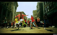
 Figure 2:
Again the left hand side picture is my video where I replicated the dance moves of Chris Brown
Figure 3:
 The picture on the right is the original dance from the Inbetweeners movie which i used in my video on the left
Figure 4:
 Another intertextual reference, this time to the music video of Ed Sheeran's 'Drunk' (right)
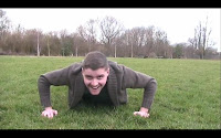
 Figure 5:
The video 'Down with the trumpets' (right) by Rizzle kicks contains another reference I used in my video for a different editing effect
Figure 6: Figure 7 :
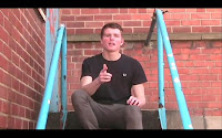
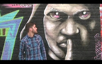
Figure 8: Figure 9:
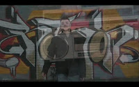
Figure 10 :
Whilst constructing my website home page as one of my ancillary texts, I had to consider all of the key features of a website page in modern society and how it influences a band/artists career. I looked at Ed Sheeran's home page and analysed it after looking at various pages. I chose Ed Sheeran as he is an upcoming artist who many in my target audience listen to and buy associated products. This in mind I modeled my home page around his with my own ideas blended into it. I chose to place a picture of Danny (D.C.N) and Luke (featured artist) in the background with them both standing in front of the graffiti wall which appears in the music video of 'Stereo Hearts'. This direct link to the new video immediately advertises the new song and I carefully placed various advertising strategies around the page as that's how artists sell products and their music online. More and more of my teenage audiences are using the internet to download music rather than buying hard copies. This in mind, I placed an Itunes format text box on one side of the page with the names of various songs which would all have links to an official site where they can purchase the track after hearing a sample of it on my page. Another common place feature of a website page is a link to the official video on You tube. I placed a screenshot of the video on my page and began to place different shapes with effects on them to look like the video on the front of Ed Sheerans place, making the page look professional. I was aware of the significance of media links over the internet and made full use of it with hyper -linked pictures of social networking sites like Facebook and Twitter on the page. I also made a 'live' link to D.C.N's Facebook and Twitter accounts which are the main source of information aside from websites for fans to 'like' or 're tweet' things from their favourite artists. I also pasted various pictures from the photo shoot for my digipack on to the website page to form a gallery of photos for fans to look through who would be able to again 'like' or 're tweet' over social networking sites. I also ensured that the name of the text i used and effects for the name of the band was the same as the ones on the digipack to maintain continuity and give the band a recognised name. I created this page on an A4 blank document on Photoshop. As mentioned earlier, my previous experience on this software meant I could put together a good page relatively quickly as I knew how to piece shapes and pictures together to create a final image which would be my home page. The 'live' update areas and news feed where all created by placing different sized text oxes around the page and making text fit into the boxes to look realistic. I feel that overall, my ancillary texts worked very well and would appeal to my target audience as they match exactly what they want. Both of my products incorporate everything my research indicated I needed to in keep my genre and satisfy consumers. My knowledge of existing texts and social media really helped me make a more realistic final product. If I was to re make my ancillary texts or my video, I would obtain even more detailed research and plan more efficiently leaving no room for error and even a few extra hours on my web page and back cover of the digipack.
Figure 1:
On the left, my music video and on the right is my inspiration (official video).

 Figure 2:
Again the left hand side picture is my video where I replicated the dance moves of Chris Brown
Figure 3:
 The picture on the right is the original dance from the Inbetweeners movie which i used in my video on the left
Figure 4:
 Another intertextual reference, this time to the music video of Ed Sheeran's 'Drunk' (right)
 Figure 5:
The video 'Down with the trumpets' (right) by Rizzle kicks contains another reference I used in my video for a different editing effect
Figure 6: Figure 7 :


Figure 8: Figure 9:

Figure 10 :


No comments:
Post a Comment